Suggested Learning Intentions
- To gather and organise data to answer questions about our world
- To explore various graphic techniques and explain how they provide a different picture of the shape of the data
Sample Success Criteria
- I can gather and organise my data to answer questions about the sample population the data came from
- I can demonstrate my solution and thinking using a variety of manipulatives
- I can describe key features of graphs
- I can construct graphs in ways that help me represent and understand data
Year 5 students are naturally interested in their peers. This stage provides an opportunity for students to find out more about their classmates. Pairs of students will formulate questions, collect, and represent ‘Class Statistics’ data using frequency tables, strip graphs and pie graphs.
What is data?
Tune in students using the following discussion prompts:
- What is data?
- Why do we need to collect data?
- When do we collect data?
- Why is data collection a valuable tool?
- In what situations may we need to pose questions and collect data?
What’s in a graph?
Start by displaying a graph with no labels on a large screen, such as the graph from the Pet Graph problem (source: NRICH, University of Cambridge). A downloadable version of the graph is available in the Materials and texts section.
Facilitate a maths talk that will get your students asking questions and thinking and talking about data. Use the following prompts to assist:
- What do you think this graph is about?
- What questions do you think the person who made this graph was trying to answer?
- How do you think the data was collected?
- What labels would you include to make it easier to read and interpret the graph?
- What statements can you make based on the graph?
- Would the results be different if….[change of sample/population/setting]?
Also draw students’ attention to ‘shape of the data’:
“a sense of how data are spread out or grouped, what characteristics about the data set as a whole can be described and what the data tell us in a global way about the population form which they are taken” (Van de Walle et al., 2019, p. 530).
Discuss the way the column graph shows how the data clusters in different categories and they way the type of graph adds a dimension of quantity. Ask students: Where is the data ‘clustering’? Where is it not?
Pet Graph
Next, distribute copies of the Pet Graph problem to students. Explain that students should read the problem and figure out the solution without using pencil or paper.
Give students time to solve the problem in their heads. Ask students to quietly give a 'thumbs up' against their chest to signal when they have the solution.
Invite students to share their strategies and ask them to justify their answers. As students share, record their strategies and record their names on an anchor chart. This gives the student ownership over their particular strategy. Invite more students to share by asking, ‘Did anyone do it differently?’
Enable students requiring further support by asking:
- Which bar was the easiest to identify?
- How could you record what you know?
Extend students by asking them to devise their own class data problem.
In this section, students pose questions and survey their classmates. They learn how to represent the information in strip graphs and pie graphs. The value of having students construct their own graphs is that they are personally invested in the data, and they learn how a graph conveys information. It is recommended that students work in pairs for this task.
Formulating questions
As a whole class, brainstorm ideas about when or why we need to collect data and the types of questions that are asked.
Ask students: 'What is the difference between a statement and a question?'
One example is that we use questions to help us gather information about a statement. Invite students to develop a statement about something they would like to explore and collect data about.
Next, develop and refine questions so that they are worded in a way in which they can be answered using statistics (see Stage 2). Model how to create questions for students, focusing on ensuring precise wording is used. For example, if a student is asking something about ‘the most popular’ – what do they mean by that? How do they check? Are their questions going to give them the information they want?
Collecting data – which method?
Compare methods of collecting data. For example, which method should be used to decide what month has the greatest number of student birthdays in it? Data could be collected by surveying students as they arrive at school, using the class roll, creating a tally sheet for students in each classroom to complete or grouping students in the school into birth months on the oval or in a large space and counting.
Ask: 'Which method would be the simplest? The most helpful? The most accurate?'
Students decide on the method they will use to answer their questions and justify their choice. Why do they think it will be helpful?
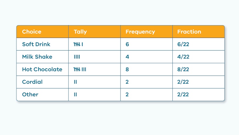
Once students have decided on their method, ask students how they will systematically record their data (unless they are using pre-existing data). For example, students might construct a Frequency Table with the following the headings: Category, Tally, Frequency and Fraction. Discuss the definitions of each of these terms.
Demonstrate how to record the categories and data in the frequency table. For example, if the topic is ‘Favourite Drinks’, the categories should be options that will be popular with other children their age. Choose four popular categories, for example, soft drink, milk shake, hot chocolate, cordial. All other choices will be counted as 'other'.
Revise how to record tally marks and record the number in the Frequency column. Demonstrate how to record the frequency as a fraction of the whole class. For example, if 6 out of 22 students prefer soft drink, the fraction will be ⁶/₂₂.
Provide time for students to collect and record their data.
Enable students by helping them to make, record and count the tally marks (by fives) and record the frequency and fractions. For a class of 22 students, for example:

Extend students by asking them to estimate the probability of a random student having a certain preference.
Represent the data
Introduce the students to making a strip graph.
Ask students ‘How might we present our data on this 1-metre-long strip of paper?’
On a strip graph, the segments of the strip represent the different categories. The strip graph will be broken into five parts to represent the five different choices.
Ask students ‘How might I divide my 1 metre strip into 22 parts (for 22 students)?’
Encourage students to suggest how to divide the strip. For example, students may suggest that 100 divided by 20 is 5, and 22 is close to 20, so each part is close to, but slightly smaller than 5 centimetres long. Students may wish to use a calculator to discover the exact answer, which may lead to discussion of ‘rounding’.
Divide the strip based on student suggestions. Identify each category through shading and labelling on the strip.
Ask students: ‘What if one of the choices has zero frequencies?’
Provide time for students to represent their data on a strip graph.

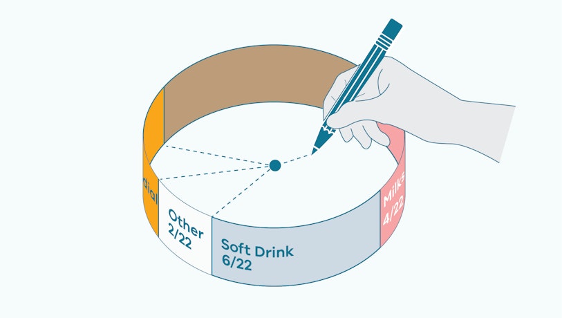
Fasten the ends of the strip together to create a circle. Place the circle on a piece of paper and draw a circle around it. Estimate the centre of the circle and mark the five sections (categories) by drawing lines from the centre to the edge of the circle. Next, demonstrate how to turn the strip graph into a pie graph. Remind students that pie graphs (or circle graphs) are a useful way to show relative sizes or proportion, making it easy to see favourite options immediately.

Mark each section of the pie graph with the category and the fraction. For example, ‘Soft drink ⁶/₂₂’.
Draw students’ attention to the ‘shape’ of the data and how pie graphs each show how the data cluster in different categories. “A pie graph focuses more on the relative values of this clustering” (Van de Walle, 2019, p.530).
Enable students requiring further support by using a beaded string and looping it around the circle. Invite students to count the beads in each sector. This visual aid helps students to see connections between the fraction of the class total (e.g., ⁴/₂₂) and the percentage.
Extend students by demonstrating how to convert fractions to percentages using a calculator. A percentage is a fraction of 100, so ⁶/₂₂ x 100 = 27%.
Areas for further exploration
You could extend student understanding of pie graphs by:
- providing students with this pie graph and ask them to create a short story to match the data; prompt them to describe the survey question and the total amount of survey participants
- exploring misleading graphs.
Interpreting data
Make a wall display of students’ work. Invite students to present their findings in small groups. Model how to describe data and make basic inferences. Depending on the data produced by your class, some prompts could include:
- What does this data tell us about our class? What doesn’t it tell us?
- Where does/doesn’t the data ‘cluster’?
- What might we infer about Year 5 students?
- What similarities and differences might we find if we surveyed another class? Or if we surveyed teachers? Variability is an important statistical concept.
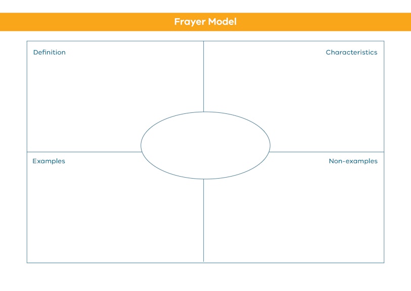
Assess student understanding of data vocabulary by asking them to complete a Frayer model. Vocabulary terms might include data, percentage, column graph and pie graph. You might divide the class into groups and ask each group to examine a different statistical term, then present their thinking. You could use this strategy to build data vocabulary throughout the learning sequence, and collate the Frayer models to build a word wall. More information about using Frayer models to support student understanding can be found here.

Formative assessment of student learning can include the use of data journals. You might ask students to sketch their graphs and explain what each graph shows, or to describe the mathematical skills learned in this stage. Invite student to provide evidence of how they are demonstrate their current understanding of data:
- I can gather and organise my data to answer questions about the sample population the data came from.
- I can construct graphs in ways that help me represent and understand the data.
- I can describe key features of graphs.
9 Story Media Group, 2013. If the World Were a Village - Promo. [Online]
Available at: https://www.youtube.com/watch?v=XUHA2-YRtKA
[Accessed 15 March 2022].
ABC News, 2017. Census 2016: This is Australia as 100 people. [Online]
Available at: https://www.abc.net.au/news/2017-06-27/census-australia-as-100-people/8634318?nw=0 28 June, 2017
[Accessed 15 March 2022].
Central Intelligence Agency (CIA), 2020. World Factbook: Australia. [Online]
Available at: https://www.cia.gov/the-world-factbook/countries/australia/
[Accessed 15 March 2022].
Gapminder, 2020. Play with the Data. [Online]
Available at: https://www.gapminder.org/tools/#$chart-type=bubbles
[Accessed 15 March 2022].
Global Change Data Lab, 2020. Our World in Data: World Population Growth. [Online]
Available at: https://ourworldindata.org/world-population-growth
[Accessed 15 March 2022].
Good Magazine, 2016. Good Data: If the World were 100 People. [Online]
Available at: https://www.youtube.com/watch?v=QFrqTFRy-LU 14
[Accessed 15 March 2022].
Harvard Graduate School of Education, 2019. Project Zero: Connect, Extend, Challenge. [Online]
Available at: https://pz.harvard.edu/sites/default/files/Connect%20Extend%20Challenge_0.pdf
[Accessed 15 March 2022].
Kahoot, 2013. Kahoot. [Online]
Available at: www.kahoot.com/
[Accessed 11 May 2020].
Plickers Inc, 2019. Plickers. [Online]
Available at: https://get.plickers.com/ 2019
[Accessed 15 March 2022].
Smith, D. J., 2020. If the World Were a Village: A Book about the World's People. 2 ed. Toronto: Kids Can Press Ltd..
Toby Ng Design, 2020. The World of 100. [Online]
Available at: https://www.toby-ng.com/works/the-world-of-100/
[Accessed 15 March 2022].
University of Cambridge, n.d. NRICH: If the World Were a Village. [Online]
Available at: https://nrich.maths.org/7725
[Accessed 15 March 2022].
Walle, V. d., Bay-Williams, J., Lovin, L. & Karp, K., 2018. Teaching Student-Centered Mathematics. Developmentally appropriate instruction for grades 6-8. 3 ed. New York: Pearson Education.
Worldometer, 2020. World Population Clock. [Online]
Available at: https://www.worldometers.info/world-population/
[Accessed 15 March 2022].
Other stages
2. Talking Rubbish
EXPLORESuggested Learning Intentions
- To design questions that can be answered using statistics
- To investigate how data can be used to solve real world problems
- To describe data using numbers; these are called statistics
Sample Success Criteria
- I can design a question to investigate that can be answered using statistics
- I can collect, analyse, and interpret data to address a real-world problem
- I can model data using a variety of manipulatives
- I can describe data using statistics
3. Demographic Diversity
EXPLORESuggested Learning Intentions
- I can design a question to investigate that can be answered using statistics
- I can collect, analyse, and interpret data to address a real-world problem
- I can describe data using statistics
Sample Success Criteria
- I can design a question to investigate that can be answered using statistics
- I can collect, analyse, and interpret data to address a real-world problem
- I can describe data using statistics
- I can model data using a variety of manipulatives and use this to analyse the data
4. Welcome to the Global Village
EXPLORESuggested Learning Intentions
- I can design a question to investigate that can be answered using statistics
- I can collect, analyse, and interpret data to address a real-world problem
- I can describe data using statistics
Sample Success Criteria
- I can explain how populations differ using statistics and graphic techniques
- I can model data using manipulatives
- I can justify my choices of how I represent data visually or with statistics
- I can communicate my findings effectively